Solar System Art Design
The Banished Vault Design Diary 10
Today's design diary is the first art focused one, going into the evolution of the art and style of the delta-v/energy maps displaying the solar systems.
You can track a lot of the design evolution of the game by looking at how the art and interface change over time. I'll be doing a guided tour of the look of the map of solar systems in The Banished Vault, and you'll be able to see those changes in theme, interface, information, and generally just visual look.
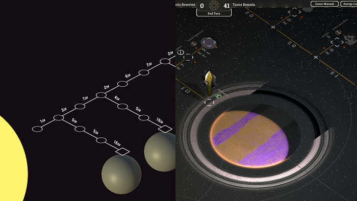
The origin point of the map are delta-v maps, which provide a clean graph structure for the energy costs in traveling around the solar system. These maps don't reflect all the details that go into spaceflight, but are still very detailed and provide a great abstract view of how the solar system is organized, and how spaceflight is considered from a resource cost perspective.

This is the first image ever taken of The Banished Vault, about a week into production. The only thing that truly exists here are nodes as locations, and costs in between those nodes measured in delta-v. The costs are slightly randomized, but otherwise don't do anything --- there's no ships to go in between those locations.
I did know at this point I wanted a isometric perspective, to give the map some visual interest. Without the planets moving, it would be an uphill battle to make sure the map wasn't dull to look at, so tilting the graph was a start in direction. I personally am also a big fan of isometric and orthographic perspectives.
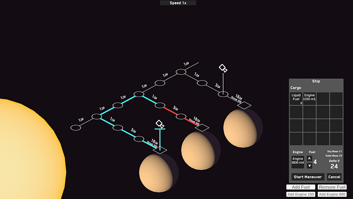
Now there are ships! The ships can move and carry cargo. The ship's path is directly reflected on the map as well. It might seem straightforward, but this was a product of a lot of design thinking: should the map be made up of nodes and lines? It could have been a grid of big cells, and the border of each cell show the cost of the movement between them. Either could have worked, but I went with this one as it gave the most freedom to display information on the map, as you'll soon see.
One thing to note here is the lighting model has tweaked slightly, lighting the planets to look like large spheres in space and less like floating ping-pong balls. The sun also has a gentle gradient to give it some visual interest.
Much of this initial iconography is also very temporary. The ships are quick little images I put together, just for something to click on. Variations of some elements will persist, like the square and circle shapes for the locations.
Moons are a hassle. You'll see over the next several images the shape and configuration of the moon branches evolve as I figure out how to squeeze information into the map without crowding the neighboring planets.
Thrust has also made it's appearance, as an additional cost to landing on planets and moons. At the end of the ship's movement path here we can see an extra bit of interface flair, showing the total delta-v/energy cost of the move, and the length in turns. This interface widget will also evolve as the information display of the map evolves.
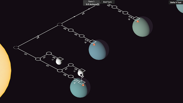
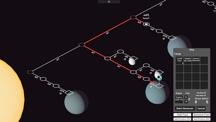
The starting point of hazards, which also is a entry point for a lot of different design challenges. Should hazards always live on a location, or between them? How should the hazards be shown to the player, or otherwise indicated on the map? Much of the initial visual design here is just putting something on screen and slowly iterating until it works. Also some slight planet color variation, just for fun.

Our first gas giant is here, noted by the generic Saturn/Jupiter color and the lack of a surface location. Additional buttons have appeared as well, to let the player go into the build view of the planet surface and orbit locations. This is the starting thread of a long period of iteration of what on the map can be interacted with. Even at this point, I didn't necessarily want a cloud of buttons everywhere, but also didn't necessarily have any better ideas yet.
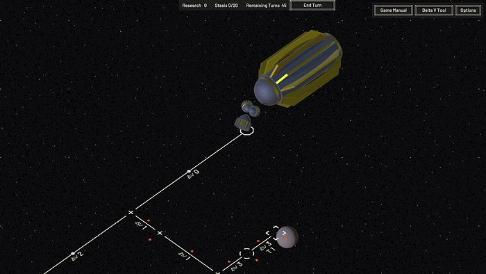
A big transition point, with lots of changes. About three months has passed between the last two images, and you can definitely tell. The starting point of the gothic theme has been implemented, with a big mothership, and some initial direction in real materials instead of vector-like shapes.
You might notice a camera tilt change as well, with the camera looking more down on the map instead of at a flatter angle. This is to give the locations on the map more breathing room, as the amount of information around them kept growing. You'll see the delta-v/energy numbers are also laid flat instead of tilted towards the player, and eventually this look is extended to have the entire map be flat.
Interactable items become 3D objects, instead of flat interface images and buttons. The initial starfield is here to begin giving the map some visual depth.

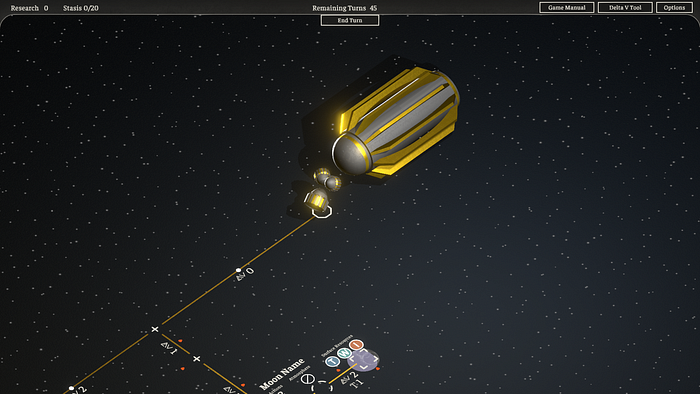
This image is actually from the same day as the previous one, and shows the angle of the camera better, plus all the additional information being tied to the space between locations. The location symbols as well have begun to evolve towards the current version.
While there is something visually interesting about the moons and planets hanging in space like this, I ultimately felt it would be too confusing from a gameplay point of view. You'll have to remind yourself that the moon in front of that planet is not actually orbiting that one, but the one just off-screen, and for visual recognition that's not ideal. Also the game interface is woefully out of date and filled with temp art, as I knew this would be undergoing a big update pass soon.

Now we can start to recognize the 'map table' look. At the start, it's pretty simple: there's a big plane in the world just below the lines and locations, and it has a gradient coming out from the center.
The tricky part here was actually the shadows of the objects casting onto that plane. I would have loved to have a single light source that sat at the sun, casting shadows radially away from it. Due to technical limitations though this looked very bad, so it had to be adjusted. You might see the shadow angles change over the following images, but essentially the lights are tied to the camera and cast shadows as the player moves around the map. I ended up preferring this look, as it adds more motion on screen.

Updates are coming in fast, as the overall setting and visual style of the game is solidified. The map lines are no longer vector style but gold and silver inlays, that react to the light. Planets are are also flattened, and as well have material properties that shine and shimmer as the player passes over them.
All of the map text and information is placed 'on' the map even though it's technically interface from the game's point of view. I start adding gradients and colors everywhere I can to make sure the overall look is vibrant, whether the player is bathed in the warmth of the sun or out in the colder edges of the solar system.


Now we arrive at the game's announcement. More detail has been stuffed onto the map in the filigree, to produce an effect of luxury and finery. Every object and interface reacts to the light, bright in the center of the screen but growing dim and desaturated at the edges. While the game doesn't fully commit to the idea that the player is looking down at the table for the entire game, I do want a lot of that effect present for the map. The map itself also has some motion in the starfield gently circling the sun, and surfaces of the planets moving.
For now this is where we pause. Visually the game is still being tweaked and updated, and you'll notice changes between these images and new ones in the future.